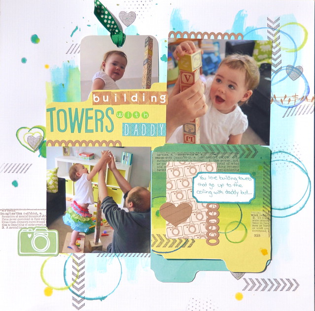
I'm excited to share my first layout for The Memory Nest as a design Team Member! It was lots of fun to make. I used white cardstock as my base, which I rarely do. I have so many fun papers that I often forget how refreshing a white background can be.
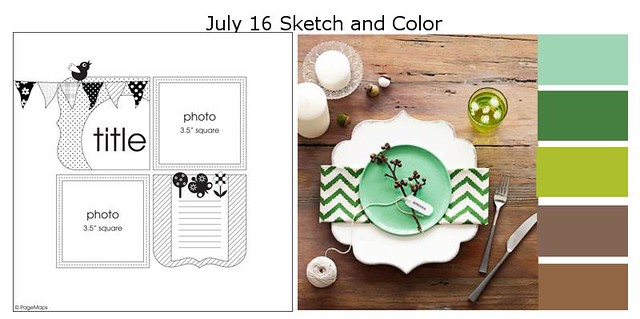
The challenge is to use the above layout and the earthy colors. While blues and greens are colors I love to use, brown isn't. I actually really dislike brown. I blame it on growing up in a very brown house. Brown furniture, brown carpet, brown paneling, and anything else you can think of that could be brown is brown in my parents house. I had to dig and dig in my stash to find a few brown items!
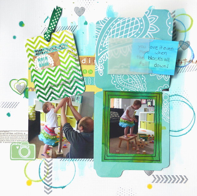
As you can see, my page is very interactive. The journaling card has a photo on one side that I wanted to use and the date on the more crazy colored side. Also, the lower right lifts up to show the tower falling down and a removable journaling card.


Love your pages and all the added touches. Great use of brown even though you aren't very found of it. Love that you have a second page.
ReplyDeleteI'm glad that you used white for your background it really makes the other colors shine.
ReplyDelete